Avoid Flash of Default Theme: An Implementation of Dark Mode in React App

Have you ever visited a page and experienced a flash of light mode before transitioning into dark mode? Recently, I worked on a project that needs to support dark mode (since this is what the cool kids do 😜). After some research, I came across an implementation that can prevent the undesired flash of default theme and would like to write it down for you and my future self.
This article is written for SSR/SSG React apps such as Next.js, GatsbyJS, but the same logic can be applied to single-page apps like CRA or other frameworks like Vuejs, Angular, etc.
Why the Flash?
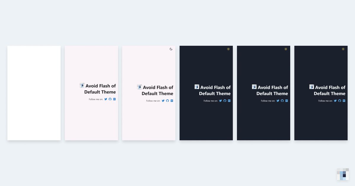
When implementing light/dark mode, one often has to reach for client-side-only features like localStorage or prefers-color-scheme. It means a default theme is required for the pre-rendered HTML and styles. When visitors open the page, the HTML elements are parsed and rendered with the default style before the update scheduled in a hook is fired, and thus the flash.
Here is an example from usehooks.com/useDarkMode.
A Better Implementation
To prevent such a flash, we can extract the logic for managing themes in the React world and move it into a separate script placed above the HTML elements so that it will run before the HTML elements are parsed and rendered.
I learned this implementation from the source code of Overreacted — A blog by Dan Abramov which is created with GatsbyJS.
<!DOCTYPE html><html><head><title>Create Next App</title><!-- links to stylesheets --></head><body><script>// 🌟 logic for managing themes goes here</script><div id="__next"><!-- content --></div><script src="/bundled.js"></script></body></html>
To add the script, you will have to edit_document.jsin Next.js projects orhtml.jsin GatsbyJS projects.
The script will do the following things:
- initializes a global
__onThemeChangevariable to be a no-op function which will be overwritten by our React component; - declares a global
__setPreferredThemefunction that when called, updates the bodyclassNameand saves the chosen theme tolocalStorage; - initializes theme to the saved theme in
localStorage, fallback to system theme.
// wrapped as IIFE to use private variables and functions(function () {function setTheme(newTheme) {document.body.className = newTheme; // "dark" or "light"window.__theme = newTheme;window.__onThemeChange(newTheme);}// this will be overwritten in our React componentwindow.__onThemeChange = function () {};// this will be triggered by our React componentwindow.__setPreferredTheme = function (newTheme) {setTheme(newTheme);try {localStorage.setItem("theme", JSON.stringify(window.__theme));} catch (err) {}};// detect system theme and monitor for changesconst darkQuery = window.matchMedia("(prefers-color-scheme: dark)");darkQuery.addListener(function (event) {window.__setPreferredTheme(event.matches ? "dark" : "light");});let preferredTheme;// try to get saved themetry {preferredTheme = JSON.parse(localStorage.getItem("theme"));} catch (err) {}// initialize preferredThemesetTheme(preferredTheme || (darkQuery.matches ? "dark" : "light"));})();
Please note the script is render-blocking so you should keep it short. Also, it will not be compiled by Babel so you should avoid using new JS features.
In the global stylesheet, we can update the CSS variables based on the CSS className
body {--background: #faf4f8;--text-color: rgba(0, 0, 0, 0.87);--link: #3182ce;}body.dark {--background: #1a202c;--text-color: #f7fafc;--link: #90cdf4;}
Now you can create your own ThemeProvider and useTheme hook to connect the global functions created.
import React, { useState, useEffect, useContext } from "react";const ThemeContext = React.createContext("light");export function ThemeProvider({ children }) {const [theme, setTheme] = useState(global.window?.__theme || "light");const toggleTheme = () => {global.window.__setPreferredTheme(theme === "light" ? "dark" : "light");};useEffect(() => {global.window.__onThemeChange = setTheme;}, []);return (<ThemeContext.Provider value={{ theme, toggleTheme }}>{children}</ThemeContext.Provider>);}export const useTheme = () => useContext(ThemeContext);
Here is a demo with Next.js:
For implementation in GatsbyJS, you may check out the source code of Dan Abramov's blog — Overreacted.io. I learned this approach from it.
Afterthoughts
When developing React apps, we tend to do everything with React and put every logic inside React components. The experience of implementing themes reminds me it is okay to write code outside of the React world and later bind it to React. After all, React is just a library for building user interfaces. In this case, understanding how browser rendering works is essential to create a smooth user experience.
Thank you for reading. Ciao!